Occasionally I’ll highlight a program/app/feature design that I think is interesting or innovative in some way.
Here’s the first of those:
Toca Boca, if you haven’t heard of them, is a company that makes innovative digital playspaces/toys for kids (particularly young ones), in the form of apps for mobile devices.
On the main screen of their apps, there is usually (I haven’t checked all of them) a tiny “For Parents” button in the upper left, and a tiny gear settings button in the upper right.
[both screenshots are from Toca Kitchen]
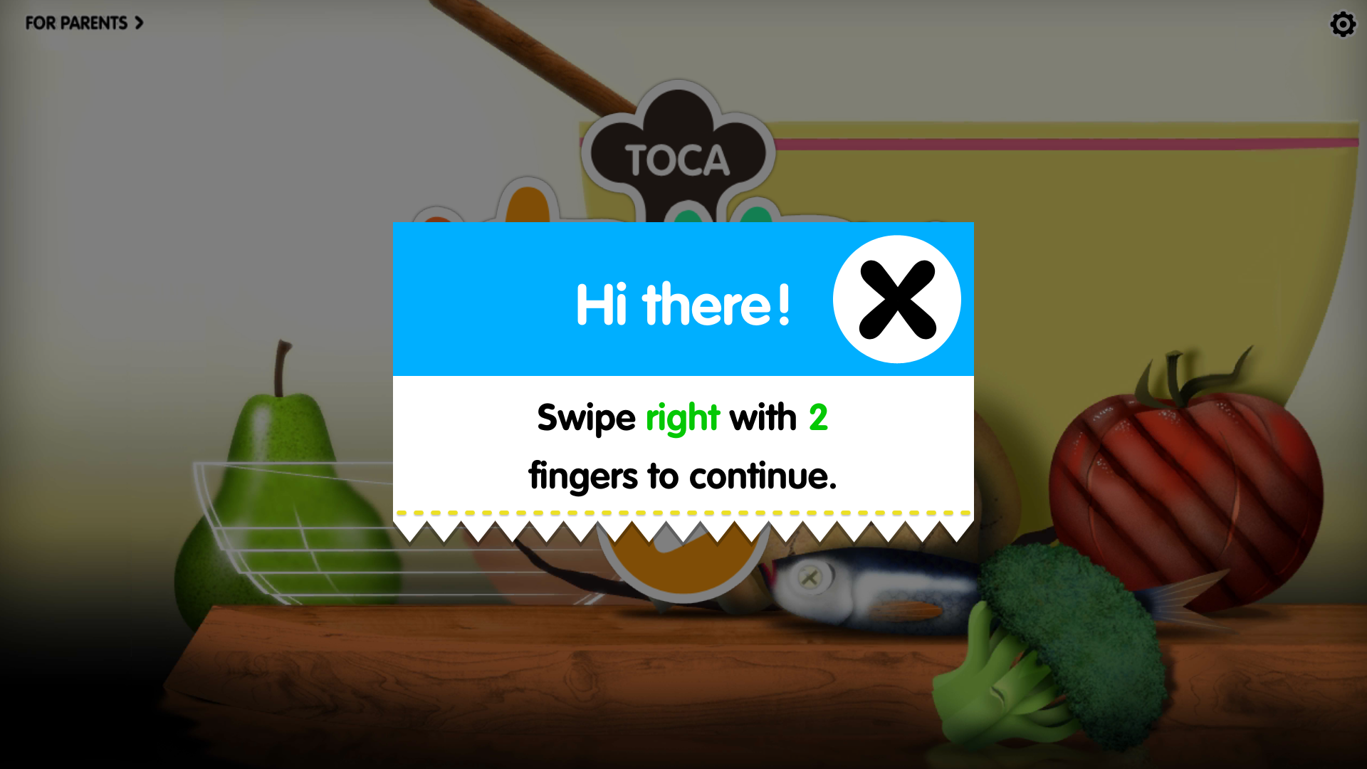
When you tap either of those, you get a pop-up like this:
 The direction it asks you to swipe in is different each time (up, down, right, left).
Tapping (instead of swiping) anywhere on the screen closes the pop-up, as does swiping with some number of fingers that is not two.
Following the pop-up directions opens up, respectively, information for adults about the particular app, or the settings menu.
This is a simple way to keep little kids from accidentally opening up a screen they can’t read or shouldn’t mess with, without adults having to set up a specific lock.
But it still keeps the information and settings handy for parents if they want it.
It’s a great example of designing for two audiences at once.
